

(and why I chose Showit)
Building a new website feels a lot like building a house. It is exciting, full of possibility, and suddenly packed with way more decisions than you expected.
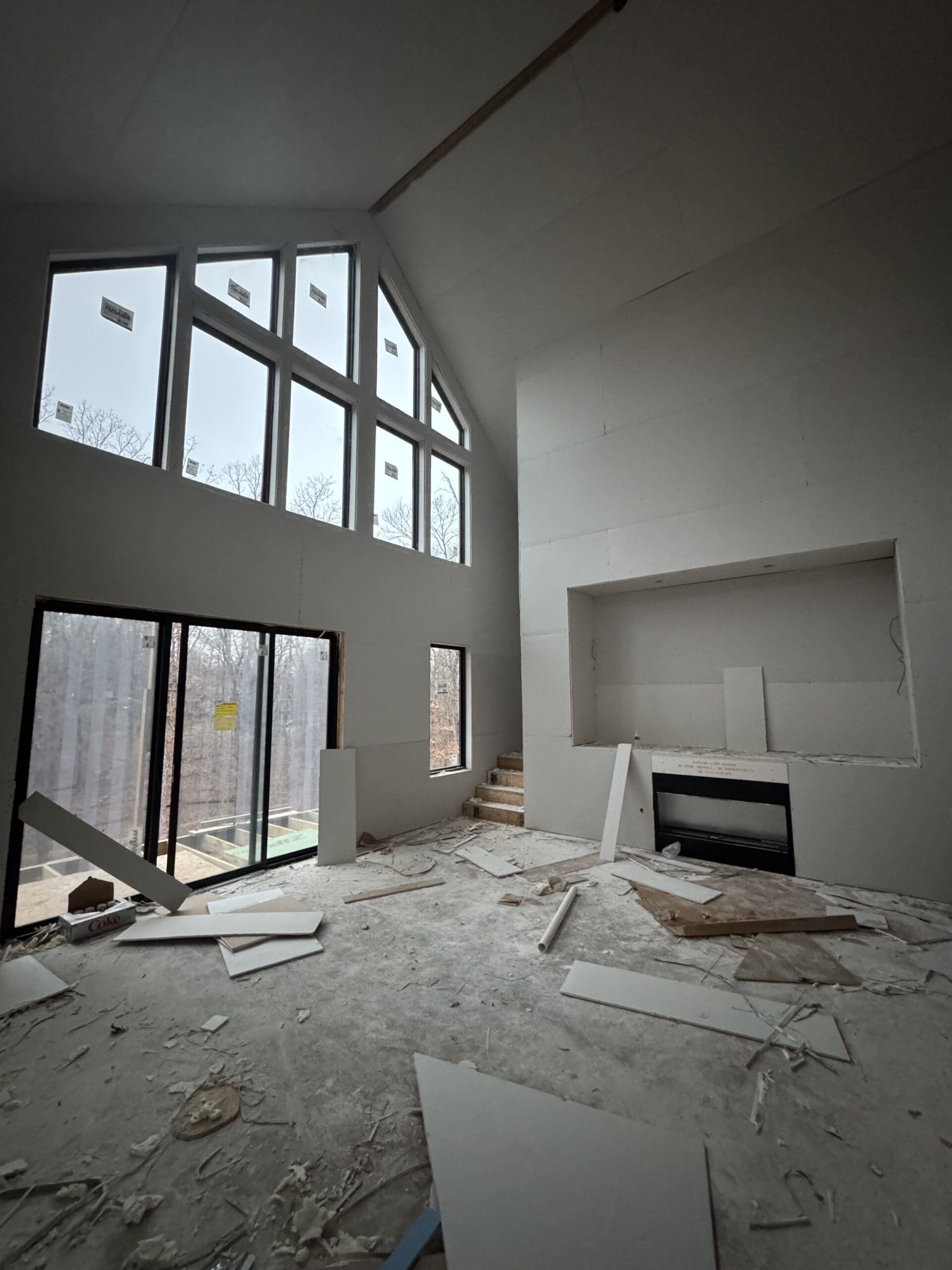
Coincidentally, I am doing both right now.
As we build our new home, I have been thinking a lot about structure, flow, and how spaces actually get used. Designing my website brought up many of the same questions. How do you want people to move through it? What should feel open and calm? What details matter most?
When it came time to choose a platform, I landed on Showit, even though I had never used it before.
Why I Chose Showit
I knew I wanted my website to feel visual, flexible, and thoughtful, not boxed in by rigid templates. Showit appealed to me because it is essentially a drag-and-drop design canvas, which felt familiar coming from a design background.
A few things immediately stood out:
- Full creative control over layouts
- The ability to design desktop and mobile separately
- Seamless blogging through WordPress
- A platform built specifically for creative businesses
Much like designing a house, I wanted a solid foundation with the freedom to make it feel personal.
Learning a New Tool
Showit definitely came with a learning curve. I had to slow down and think through how each page connects to the next, how much white space actually matters, and how a design feels once it is lived in rather than just mocked up.
Once I found my rhythm, it felt empowering. Instead of forcing my work into someone else’s structure, I was designing the space intentionally.
The Takeaway
Building this website alongside building a home has been a reminder that good design is not about rushing to the finish line. It is about making thoughtful choices that support how something will be used over time.
This site is a place for my work to live and grow, and choosing a platform that allows flexibility makes that possible.
If you are a creative thinking about building or redesigning your own site, especially if visual storytelling matters to you, Showit is absolutely worth exploring.
Jan 29, 2026
Setting up my new website
@albanylanedesigns
Let's be friends!